Do you design for peripheral vision?
Are you displaying alerts the right way?

I am a Journalist-turned-Software Engineer. I love coding and the associated grind of learning every day. A firm believer in social learning, I owe my dev career to all the tech content creators I have learned from. This is my contribution back to the community.
In my previous career as a broadcast journalist, one of my responsibilities was to produce promo videos every day for my sports shows.
Producing multiple videos every day is hard, what is even harder is to come up with ideas every single day.
So when a scheduled sports event came along - it gave me ample time to conceptualize and use a theme to produce promos.
One such promo was this.
A little context.
In 2013, the Indian cricket team was on a losing spree and had a chance to bounce back against England.
I experimented with the idea of using visual perception and sound to drive a point that the Indian team was distracted and needed to focus.
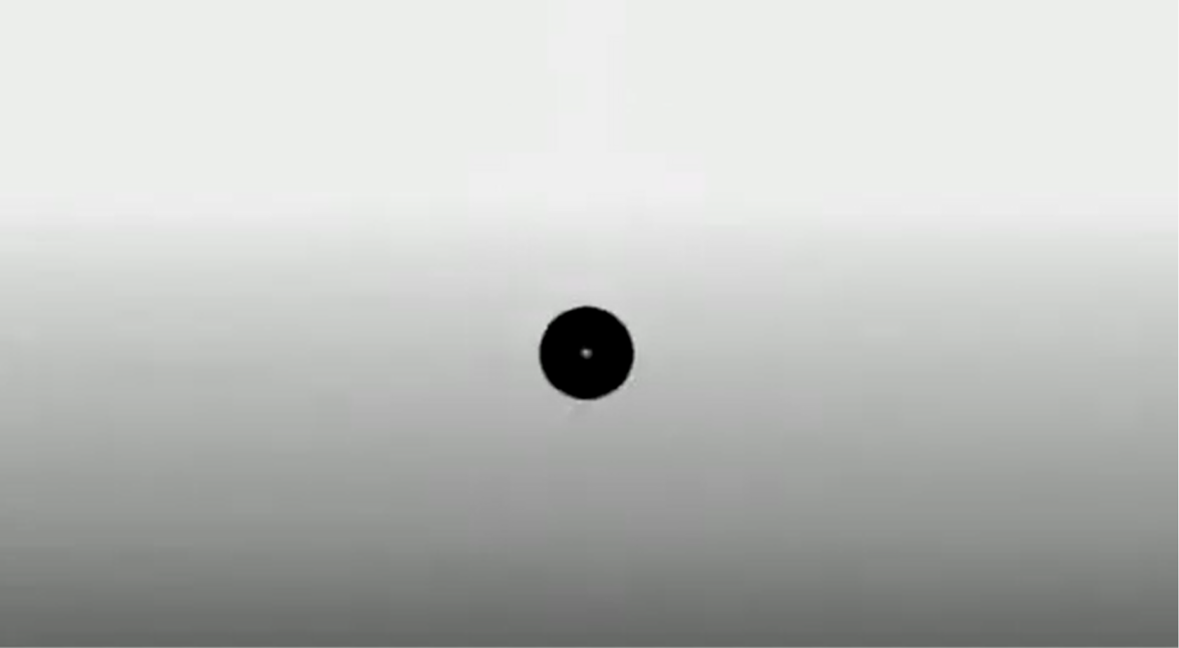
The idea simply was to direct the user to something completely unexpected.
I tried illustrating how one can be focussed on a single dot (read task/mission)
How multiple dots (tasks/missions) can be distracting.
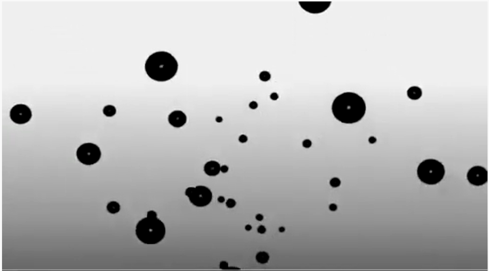
And, how the Indian team needs to focus on a single mission only.
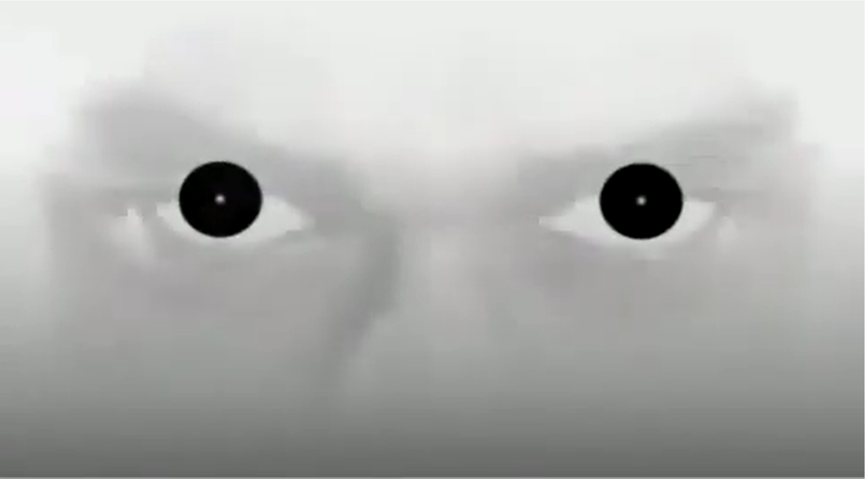
I am not sure how the audience perceived the promo; but it was well-received at work ( or maybe, my colleagues were being nice ).
I wish I had known more or read more about peripheral vision and foveal vision back then - my approach to this promo would have been completely different.
The reason I write about this promo is - an interesting experience recently reminded me of this promo. An experience where my "focus" and "vision" were tested.
When I was "Toasted"
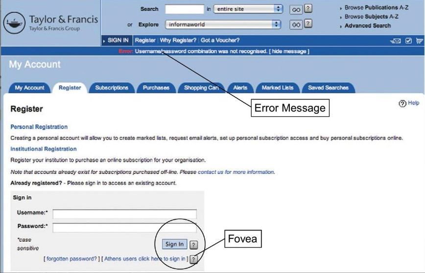
I, like many software developers, use a 32-inch monitor for work.
While browsing through a website - I clicked on a button - a critical action that I could take only once. The button was disabled immediately as it was an expensive background operation.
30 seconds passed, a minute passed and I was still waiting for a response on the screen.
I became anxious as I did not get a response even after a couple of minutes.
I immediately chatted with the customer service team and they confirmed the transaction was indeed successful. The representative asked if had seen a "green success message" on the top right of the screen. I then realized what the problem was.
The next time I did a transaction I was focused on the right corner of the screen and saw that the website had a "toastr" alert implemented which appeared and disappeared after a couple of seconds.
It looked something like this.

I had failed to even notice it the first time and let me tell you I was focused on the screen.
So what happened here?
Was the duration of the alert less?
Was I not focused enough?
Was the position of the alert incorrect?
I would say a little bit of everything.
But let me start with my "focus".
Peripheral and Foveal Vision
Did you know only 1% of human vision is high-resolution the rest is blurry?
It means - when you look at a website - the central area of your vision is clear the rest is like looking through frosted glass. The image below illustrates that accurately.
 source: https://www.sciencedirect.com/
The high-resolution area is the foveal vision and the "blurry" part is the peripheral vision.
Human Vision Is Mostly Low Resolution
The fovea—the 1% of your visual field at the center that has high resolution—is small. To see how small, hold your arm out, stick up your thumb, and focus on your thumbnail. At arm’s length, your thumbnail is about the size of your fovea. The rest of your visual field can be considered peripheral vision, with significantly lower resolution.
 source: https://www.sciencedirect.com/
Why peripheral vision is important in UX design?
Gopal Juneja, a veteran UX designer, brilliantly articulates this in his article
Peripheral vision has low sharpness but it detects, motion and sound quickly and gives cues to foveal (central) vision to move an eye in the direction of what is important on a web page. In simple terms, it guides the foveal vision to look into the desired area in the user interface.
Now how is this related to my "toastr" experience I shared earlier?
There is a high chance I missed the success message because the error message appeared in my peripheral vision or probably fell into my blind spot.
Dan Wu, a web developer, shared a similar experience in her blog.
So how can we design the right alert which is non-blocking, asynchronous, and does its job as expected?
Let's take some inspiration from Game HUD (Heads-up display) designs.
- Inspiration from game design
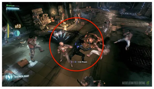
In gaming, especially the fast-paced ones like racing or shooting, a distraction of a few seconds can cost dearly.
In this post, Robert Tilford, examines some basic vision science and makes recommendations for designing in-game HUDs so that players can comprehend key information presented in their peripheral vision, without having to look away from the action.
Some that can be relevant to web design are below
Use big, stark HUD elements, with variations in brightness
Avoid clutter
Don’t use strings of text
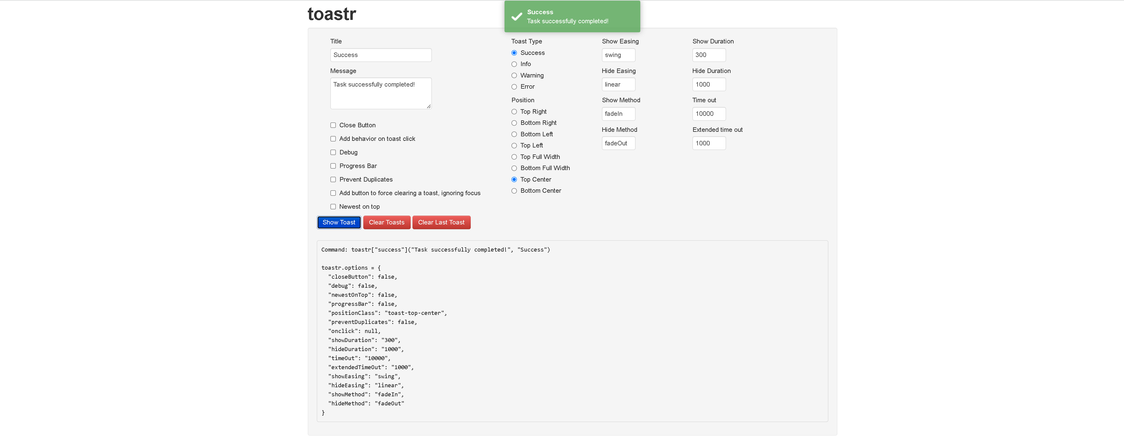
The right Toastr configuration
Toastr is a great example of asynchronous or non-blocking alerts.
However, it needs to be configured correctly for maximum impact.
Some Dos and Donts
Choose the position wisely
One large screen, toastr positioned on the corners (left/right or top/bottom), could be too far away from the foveal vision and could be undetected by the peripheral vision.
The right duration and size of the toastr is the key to an impactful toastr.
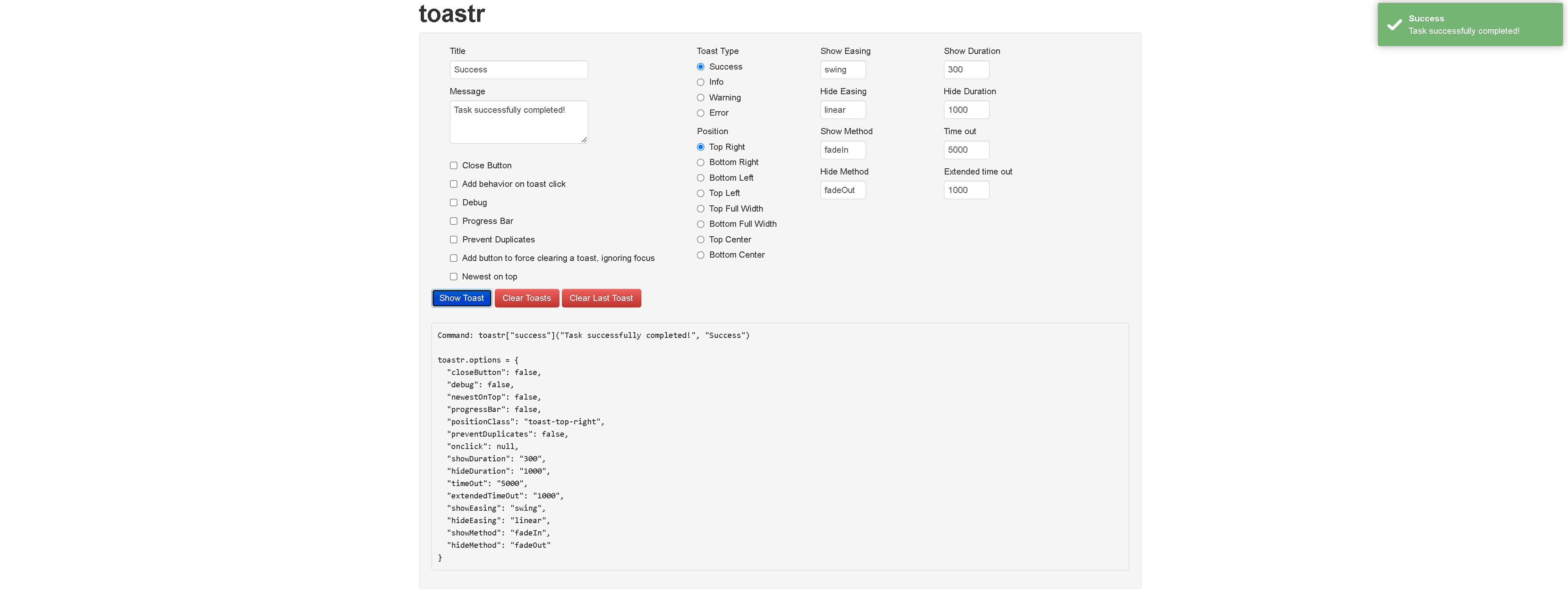
In my opinion, a toastr in the Top Center position is more impactful than in the corners.
Choose the action wisely
A toastr might not be the right alert system for action with long processing. A toastr is impactful if the perceived wait time for the user is neglible.
If you liked what you read, please subscribe for interesting articles on Web Performance, Usability, and Frontend System Design.
References:
- https://www.sciencedirect.com/science/article/pii/S0097849321002211
- http://realityonweb.com/designing-for-peripheral-vision/
- https://batesmeron.com/fovea-peripheral-vision-and-web-design/
- https://medium.com/@JoeViergutz/peripheral-vision-and-ux-design-30d1f2b3cf44
- https://www.gamedeveloper.com/design/perceiving-without-looking-designing-huds-for-peripheral-vision