I am a Journalist-turned-Software Engineer. I love coding and the associated grind of learning every day. A firm believer in social learning, I owe my dev career to all the tech content creators I have learned from. This is my contribution back to the community.
This article is part 2 of the HTML Table Deep Dive series. If you want to read part 1 - The History - click here
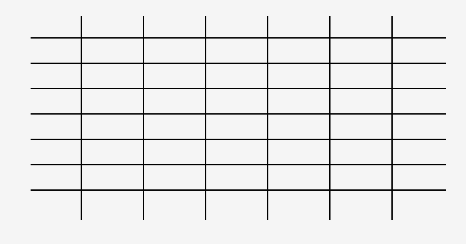
A table, essentially, is information arranged in rows and columns. Although the grid lines i.e. the vertical and horizontal lines add to the visual distinction - it's the arrangement of information that characterizes a table.
But just adding data to a table will not make it useful. To present data visually in an effective way, you must understand a little about visual perception.
Visual Perception
Visual perception is the ability to perceive our surroundings through the light that enters our eyes and falls on the retina. The light-receiving cells on the retina change light into a series of electrochemical signals to be transmitted to the brain. The experience of visual perception is in fact what goes on inside our brains when we see a visual.
Visual perception is selective. Our brain ignores all the noise and pays attention to things that attract attention - familiar patterns. Hence visualization must take into account what people know and expect.
Why should we be interested in visualization? Because the human visual system is a pattern seeker of enormous power and subtlety. The eye and the visual cortex of the brain form a massively parallel processor that provides the highest-bandwidth channel into human cognitive centers… However, the visual system has its own rules. We can easily see patterns presented in certain ways, but if they are presented in other ways, they become invisible…If we can understand how perception works, our knowledge can be translated into rules for displaying information… If we disobey the rules, our data will be incomprehensible or misleading.
Colin Ware, Information Visualization: Perception for Design, 2nd Edition, Morgan Kaufmann Publishers, San Francisco, 2004.
Ionic Memory

Look at this image of an apple. When you looked at this image - this visual was in your Ionic or Sensory Memory for a tiny period of time ( less than a second). And within those few milliseconds, the brain was able to sense the 2D location, length, width, area, shape, color, and orientation of this image. This process is called preattentive processing and it happens automatically, even before we pay attention to the information.
When data is represented in the form of preattentive visual attributes, we can perceive a great deal of information rapidly and can store an entire object made up of many properties as a single chunk of memory.
Hence understanding how to make a particular attribute stand out can help us create tables that emphasize the more important information.
Designing a Table
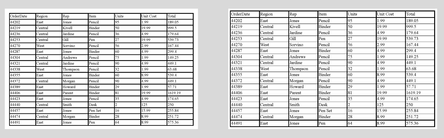
At the first glance which of the above 2 tables is more readable to you? Most probably it's the one on the right.
The table on the left uses a thick grid to delineate columns and rows and to enclose the entire table. In contrast, the table on the right uses thin horizontal rules delineating rows in the body of the table. This makes it more readable.
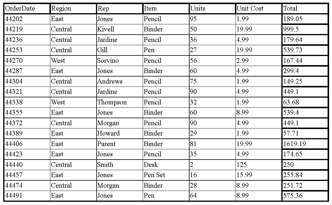
How about this one?
In contrast to the two tables above, all vertical rules, except for the last column, have now been thinned. By doing this we are leading the user to read the last column which is the total cost of all items.
Hence just by thin vertical lines, we were able to direct the user to look at the information we want her to see.
Edward R. Tufte introduced a concept in his 1983 classic The Visual Display of Quantitative Information that he calls the "data‐ink ratio."
Data-Ink Ratio
A large share of ink on a graphic should present data information, the ink changing as the data change. Data‐ink is the non‐erasable core of a graphic, the non-redundant ink arranged in response to variation in the numbers represented. Then, Data‐ink ratio = data‐ink / total ink used to print the graphic i.e. proportion of a graphic's ink devoted to the non‐redundant display of data information
Stephen Few, the author of the book 'Information Dashboard Design', explains this further with a pixel analogy for computer screens.
Reduce the non‐data content (grid lines in a table) as much as possible, and then proceed to enhance the data content with as much clarity and meaning as possible, working to make the most important data stand out above the rest
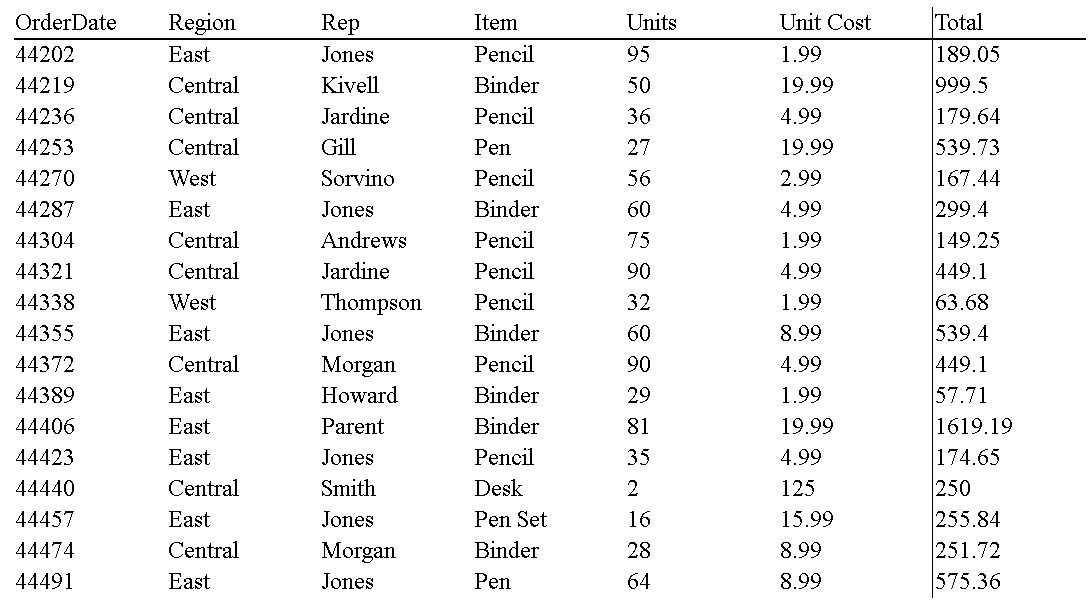
In the case of tables, when we reduce non-data content like grid lines then the table becomes even more readable.
See the table below. What do you think? Please share your thoughts in the comment section.
Typography
The main objective of the tables is to be read and not to be looked at.
Richard Rutter, in his brilliant book "Web Typography", recommends practices that can make tables very readable.
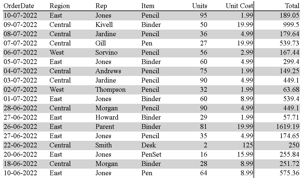
- Left-align text
- Right-align numbers
- Align headings with data
With the above rules implemented, this is how our table would look.
Accessibility
Another important aspect of table design is accessibility. It's very important to make tables accessible to everyone.
This article on the Michigan State University website explains Web Accessibility and Tables in detail.
Obviously, there is more to table design than the fundamentals called out in this article. You can read more table designs in some brilliant books called out below.
Resources:
- http://41.33.248.151/bitstream/handle/123456789/3549/8172.pdf?sequence=1&isAllowed=y
- Information Visualization: Perception for Design (Interactive Technologies) 3rd Edition by Colin Ware
- Show Me the Numbers: Designing Tables and Graphs to Enlighten Second Edition by Stephen Few